Concrete-013.jpg
Flyer-Poster-Mockup-01---originalmockups.com.jpg

The Juicy Cafe

Goal

Develop a cleaner menu based on existing branding and make more of the brand principles shine through (more handmade, local, and empowering).

Approach

Because the menu changes with the seasons, we’ve been able to reiterate and hone in on a layout that customers really respond to. We’ve gotten into a rhythm for refreshing the menu about twice a year, swapping out seasonal menu items and adjusting to trends.

Results

Since I started working with the owner Abigail in 2015 she’s expanded from one store to four across Seattle, each with its own personality. The assets I create for her (signage, menus, stickers, packaging) are adaptable for each store’s layout and needs, balancing consistency of the brand and working with the flow of the space to make the ordering experience as easy as possible for the customer.

 Logos


Amazon Wedding Registry

Goal
Revamp the registry experience, making it a modern, one-stop-shop for people planning their wedding registries.

For me, this was an opportunity to thoughtfully represent a wide range of people and lifestyles, stretching beyond typical thin/white/cis images.

Approach
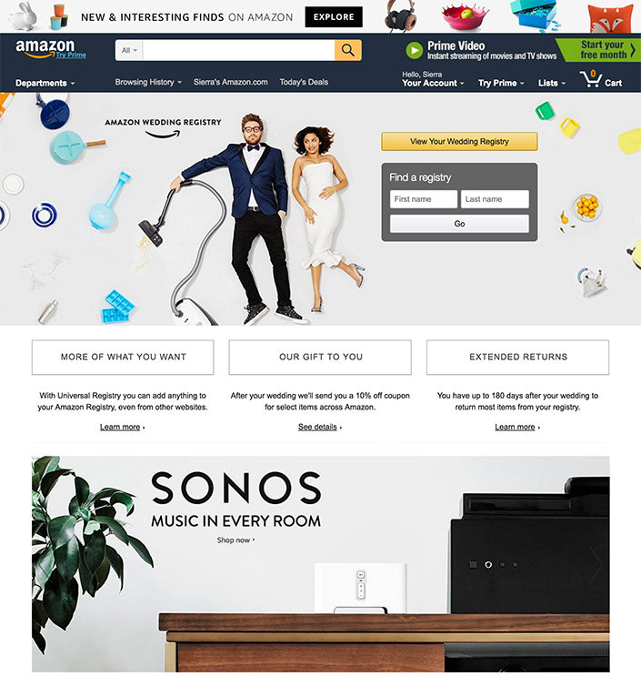
With oversight from the creative director, I expanded on a look-and-feel that was established by a photoshoot and designed out the web experience as well as a printed look book for the Wedding Registry account team to use with vendors, and finally a set of brand guidelines for ongoing use.

 
AWR_lookbook_print_spreads-1.jpg

Photo assets and look book

Goal
To create a higher standard for photo assets and start building a library of content. The look book was created as a marketing tool to show vendors and use at trade shows.

Approach
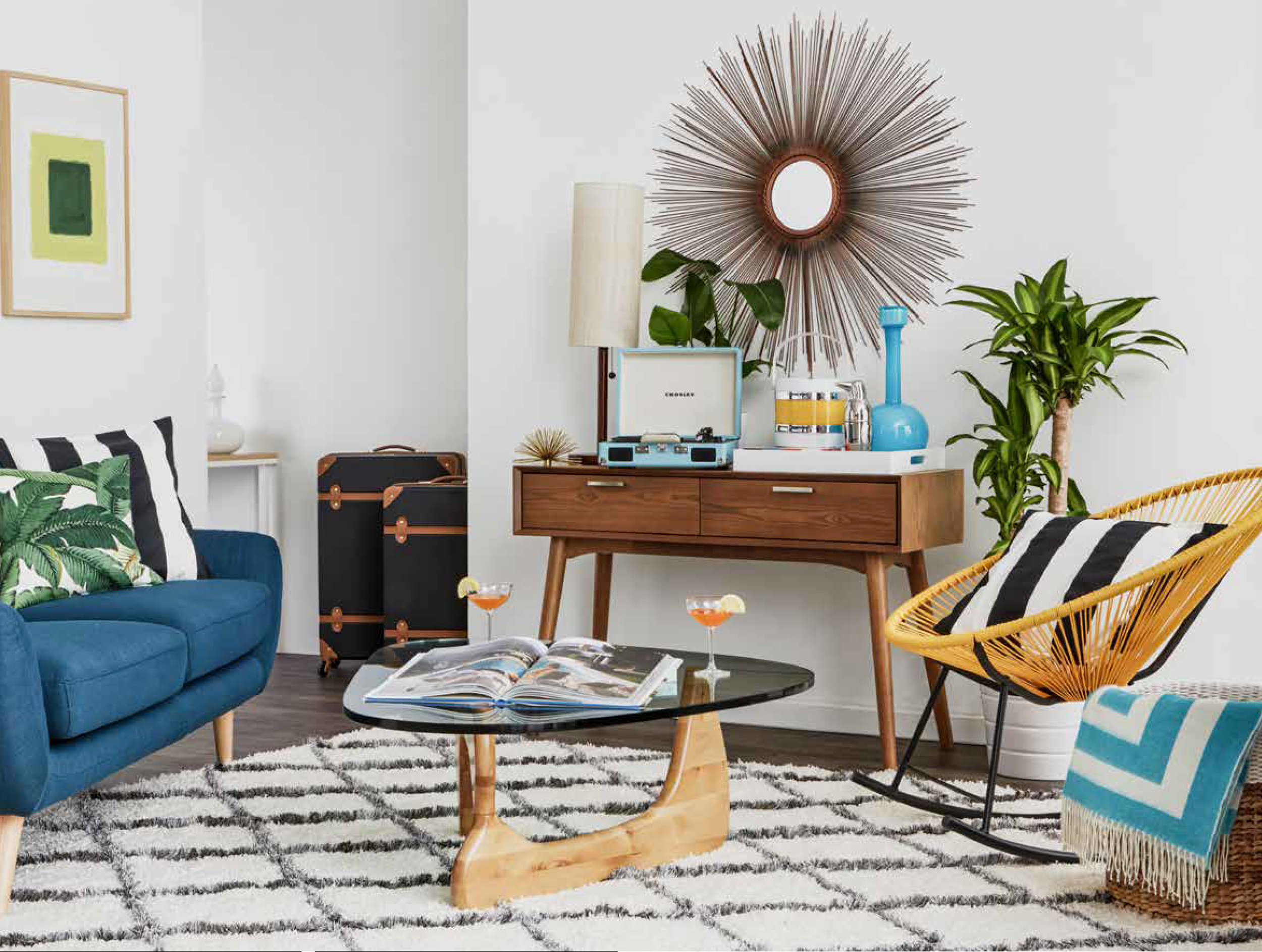
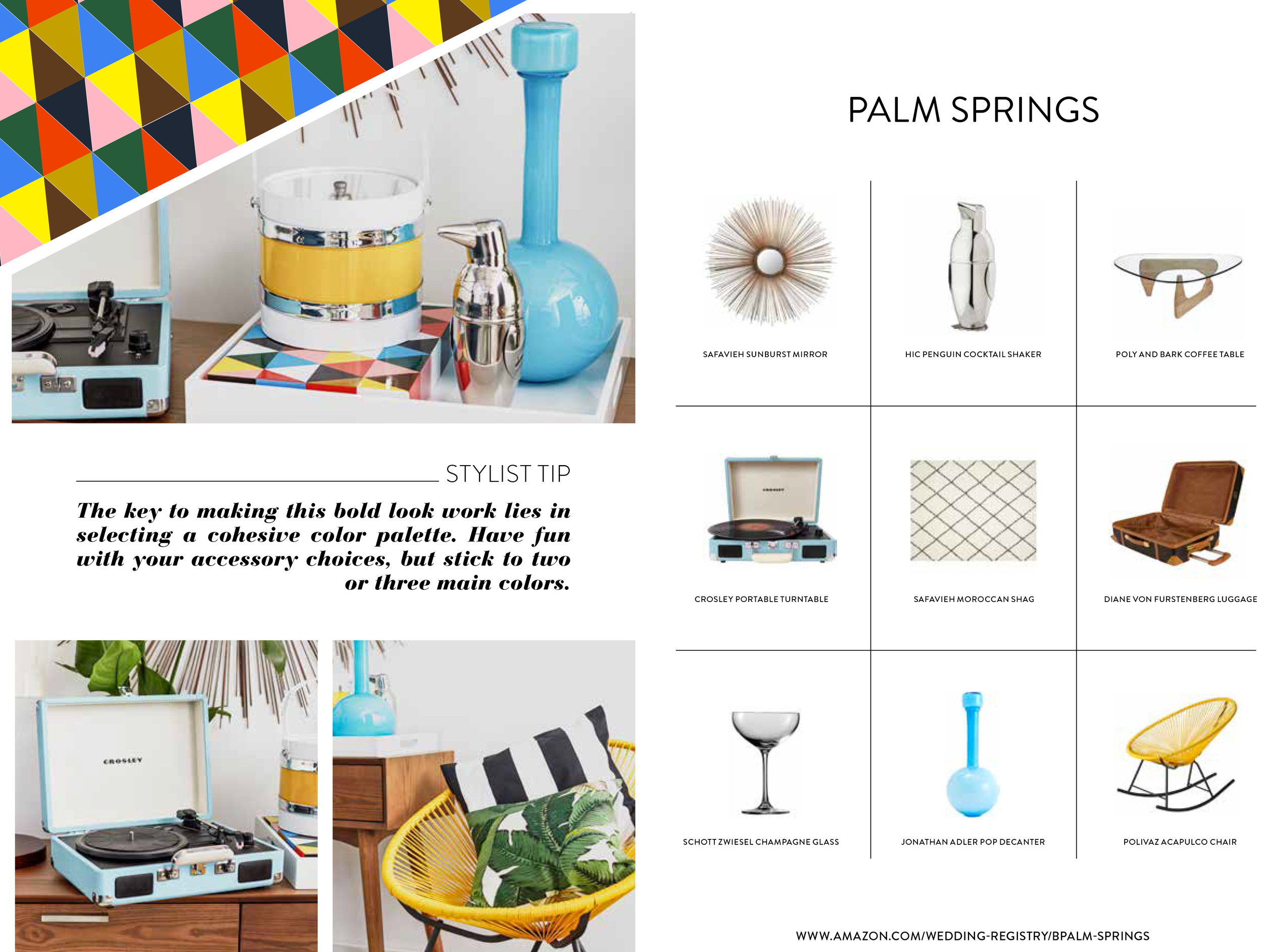
We started with a photo shoot, which we were lucky to have Cassandra LaValle from Coco Kelley helped us plan and style. I took those assets and created the printed look book. I wanted it to feel clean and organized to best highlight the products we were featuring, but also fun and relatable. Graphic elements like the colorful triangles helped get that balance.


Web

Goal
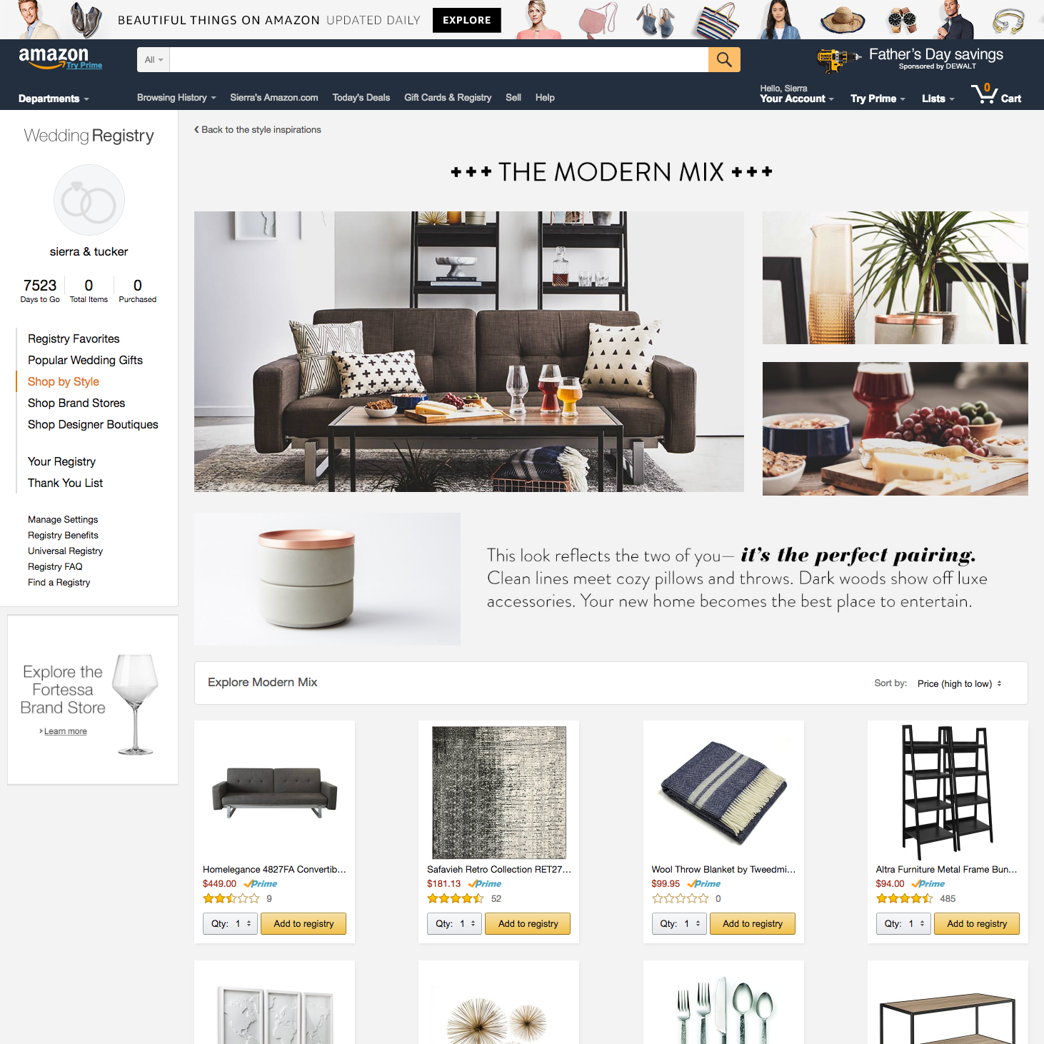
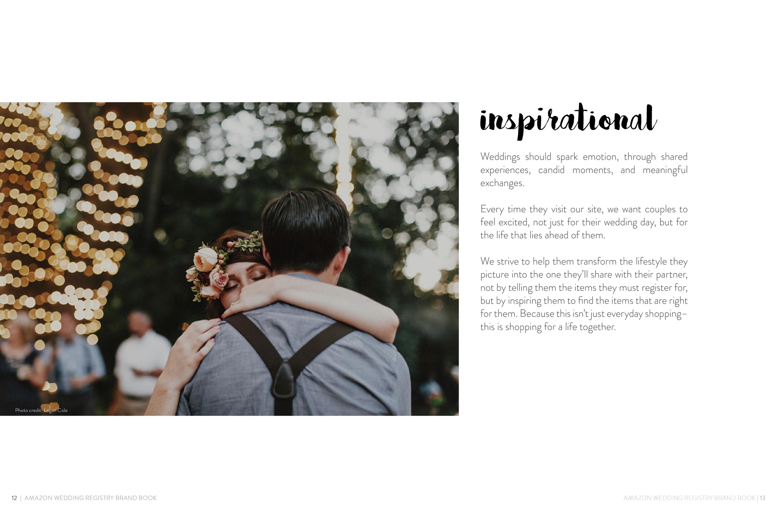
We really wanted to focus on the idea of two lives and two unique styles coming together. These pages are a place to highlight some of our favorite products and give couples ideas when they don’t know what to register for. 

Approach
I wanted these pages to have a good balance of aspirational and obtainable. A lot of the decisions were informed by thinking about a couples’ experience creating a registry together. I provided content for the main landing page, featured brand pages, and pages for each of the styles we shot for, plus on- and off-site graphics to promote the new pages.

 
styleguide-title.png

Guidelines

Goal
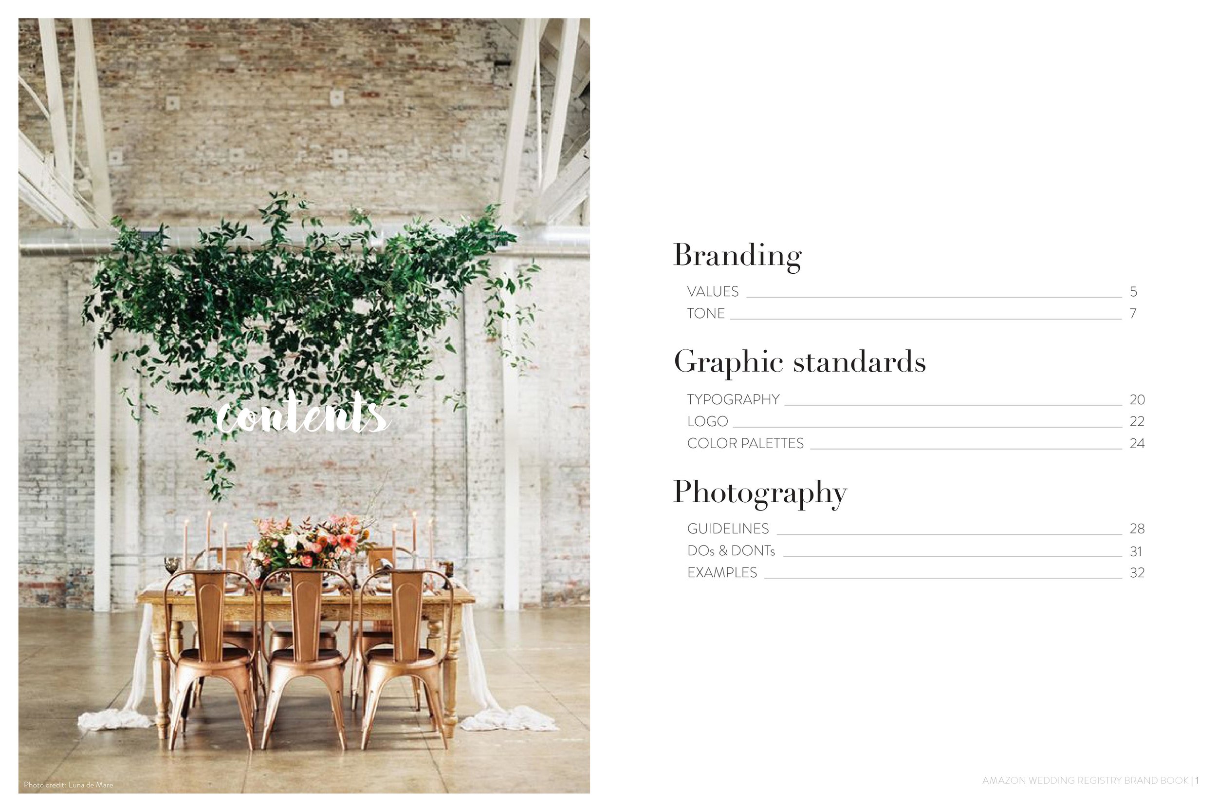
These brand guidelines were created to set a new higher standard for the wedding registry. They needed to be easy to understand so any future designer could read them and understand what the wedding registry is all about.

Approach
The work I did on the look book and the web pages was the foundation for these new brand guidelines. I also did a ton of photo research and we had brainstorming sessions with the marketing team. Also, since wedding registry exists in the same vertical as departments like home and kitchen, our graphic standards were informed by those other guidelines.